
Unfortunate scenario from my life
As a student at the University of Science and Technology, I needed to log in to my student email. Since I created my email at the beginning of my studies, I had never used it. After a few months, I returned and tried to log in because I needed my email to get a free student plan for a digital program. My experience was terrible when I realized that I couldn't log in. What mistakes were made on the AGH email login page?

Before redesign

What went wrong?
The creators of this page made several poor design choices. First, everything is too small. The login button and input boxes are literally smaller than the cursor, making it difficult for users to target the most important elements. Additionally, there is a warning about password theft via email. While it's commendable that the administrators are concerned about user privacy, the warning is displayed in an overly aggressive red color. Near the login form, it appears as though the user has made a mistake in entering their username or password. A more subtle color could be used to signal this warning.


Username, hm? But what does it mean?
At this point, I was stuck. What was my username? Was it my email address, student number, a unique login I created during the registration process a few months ago, or something else? I was unsure what to do, and every attempt was unsuccessful.
Details matter greatly
In addition to the previous issues, many elements lack visual states. This can confuse users who are unsure whether an element is interactive or not. As a result, controlling the screen without a mouse is impossible. Furthermore, all elements lack rounded corners. User research has shown that rounded corners on buttons and forms are more visually appealing.

Solution


Everything is more visible
All elements are now larger. This was an obvious change to make, as there was a lot of empty space on the screen and the previous elements were tiny. The larger fonts are more readable, and the inputs and buttons are easier to target. The contrasts are correct, making the page more accessible. The logo is centered on the screen.
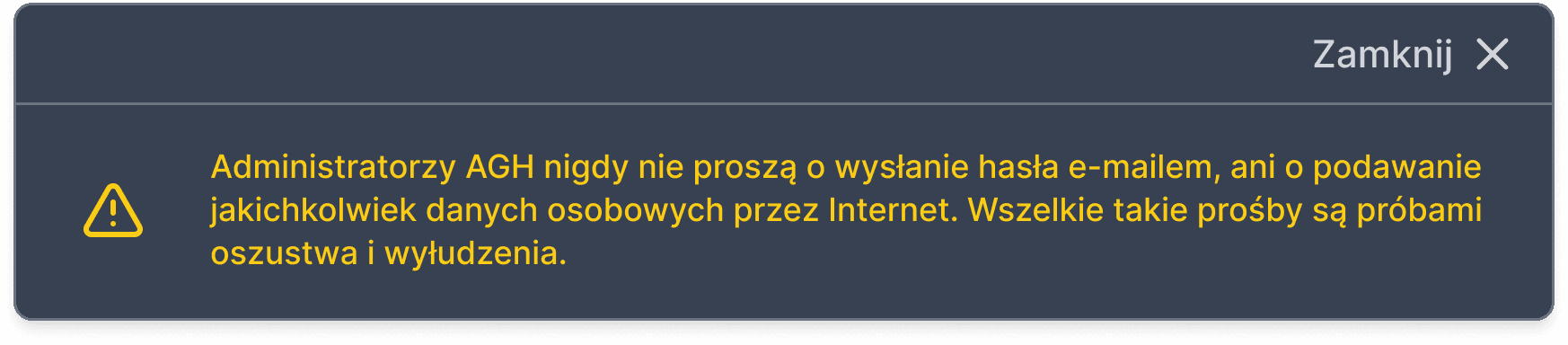
Now this warning is real warning
I used yellow for the warning design. The aggressive red color was retained to signal errors in the login form. The password warning is still visible, perhaps even more so than before, but it's no longer confusing and doesn't suggest that the user has made a mistake. There is also an option to hide this box.
2026 © Designed and developed by Filip Grzesik