
About
Futbology is an app created for football fans who like to go and watch matches in stadiums. It’s a brilliant tool for true groundhoppers. Users can add photos from matches, interact with other people who share the same hobby, and view statistics about the games they have attended.
Futbology is an app created for football fans who like to go and watch matches in stadiums. It’s a brilliant tool for true groundhoppers. Users can add photos from matches, interact with other people who share the same hobby, and view statistics about the games they have attended.
About
Futbology is an app created for football fans who like to go and watch matches in stadiums. It’s a brilliant tool for true groundhoppers. Users can add photos from matches, interact with other people who share the same hobby, and view statistics about the games they have attended.
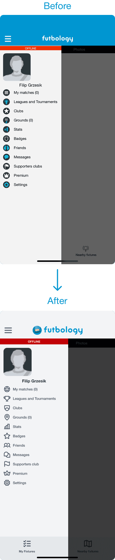
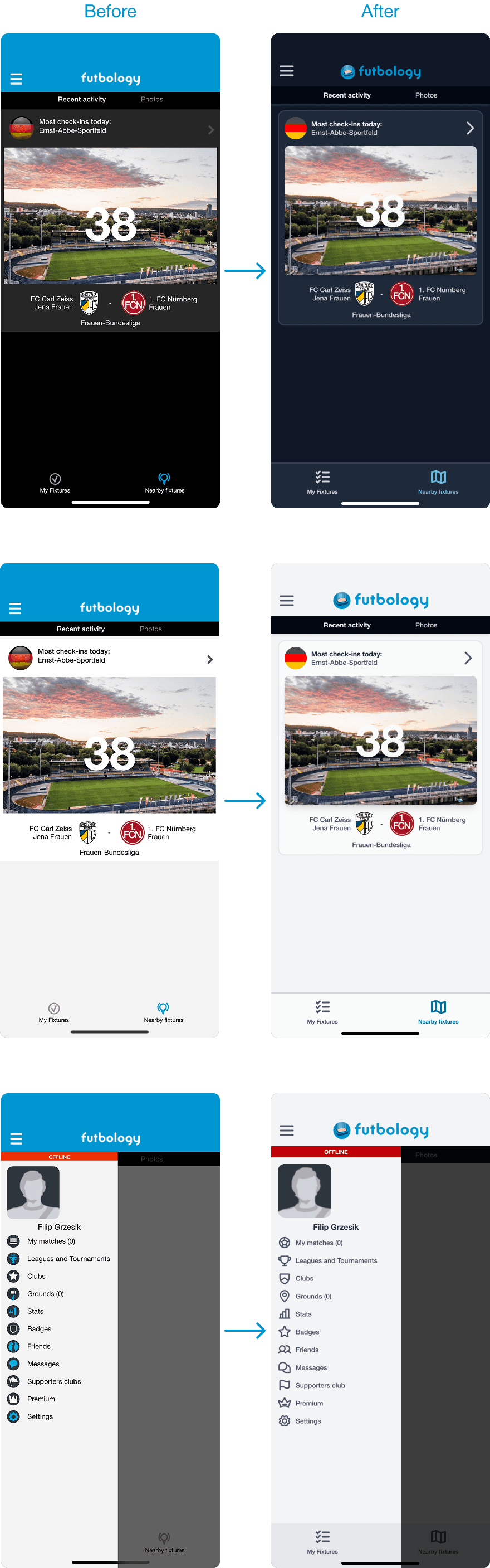
Design tokens overhaul
My task as a designer was to create new design tokens that are more accessible, consistent and aesthetic both in light and dark modes. I was asked to do this without making any major layout changes. The old design was not accessible – everything was too small and had low contrast.

Colors
The previous design had many problems with color usage. It was inconsistent and chaotic. I decided to use a monochromatic color scheme to make the whole project more consistent. Instead of pure black and white, I used shades of gray, which made the color palette smoother. I also reduced the number of colors in the project. Now, color is used only for important elements that need to be eye-catching.
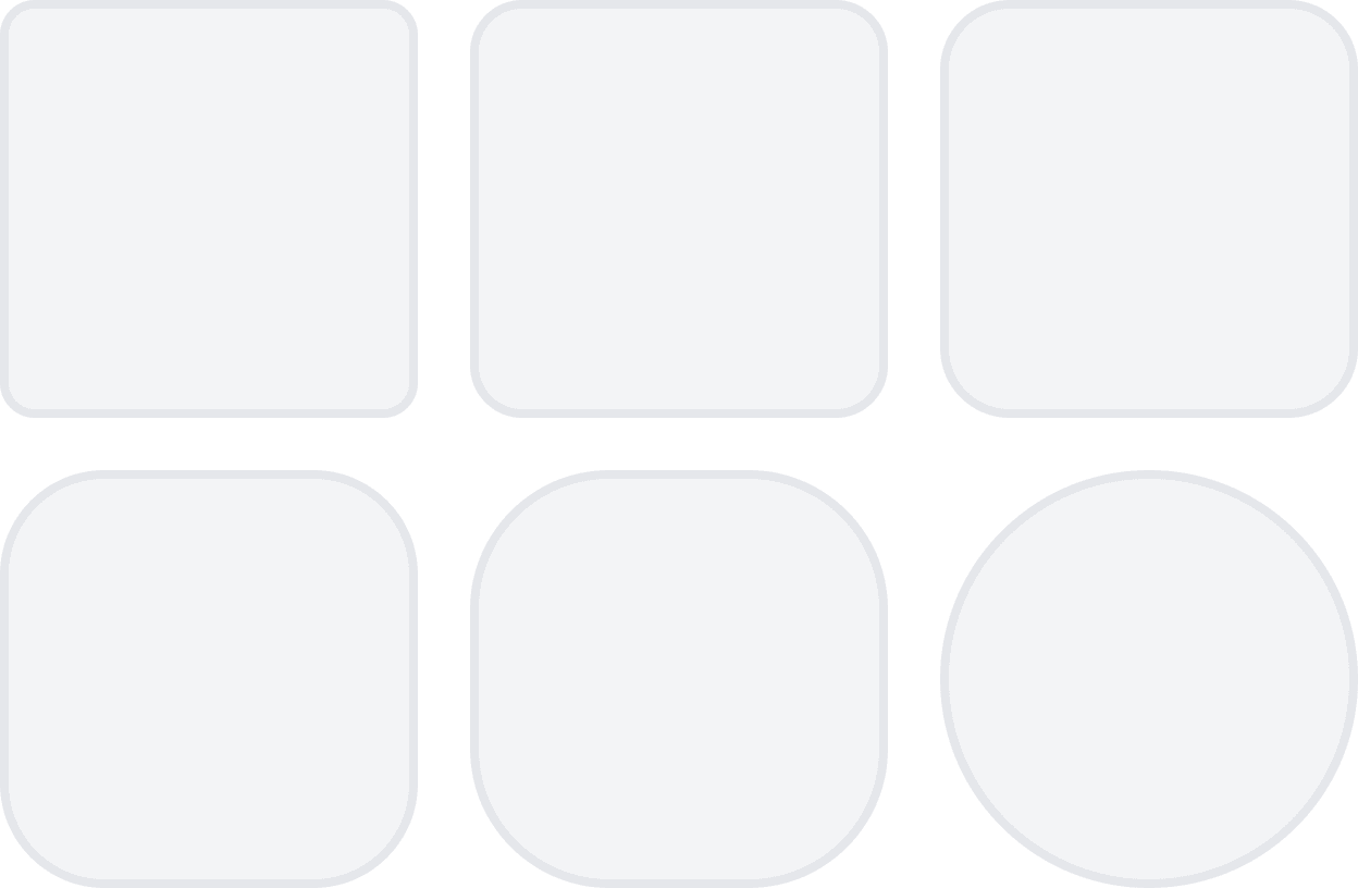
Roundings
Every element in the former design had sharp corners, which gave it an outdated look. User testing showed that rounded elements feel softer and more inviting, making users more comfortable while using the app. All corner radius values were based on a 4-point grid, ensuring that every element fits consistently with the others.
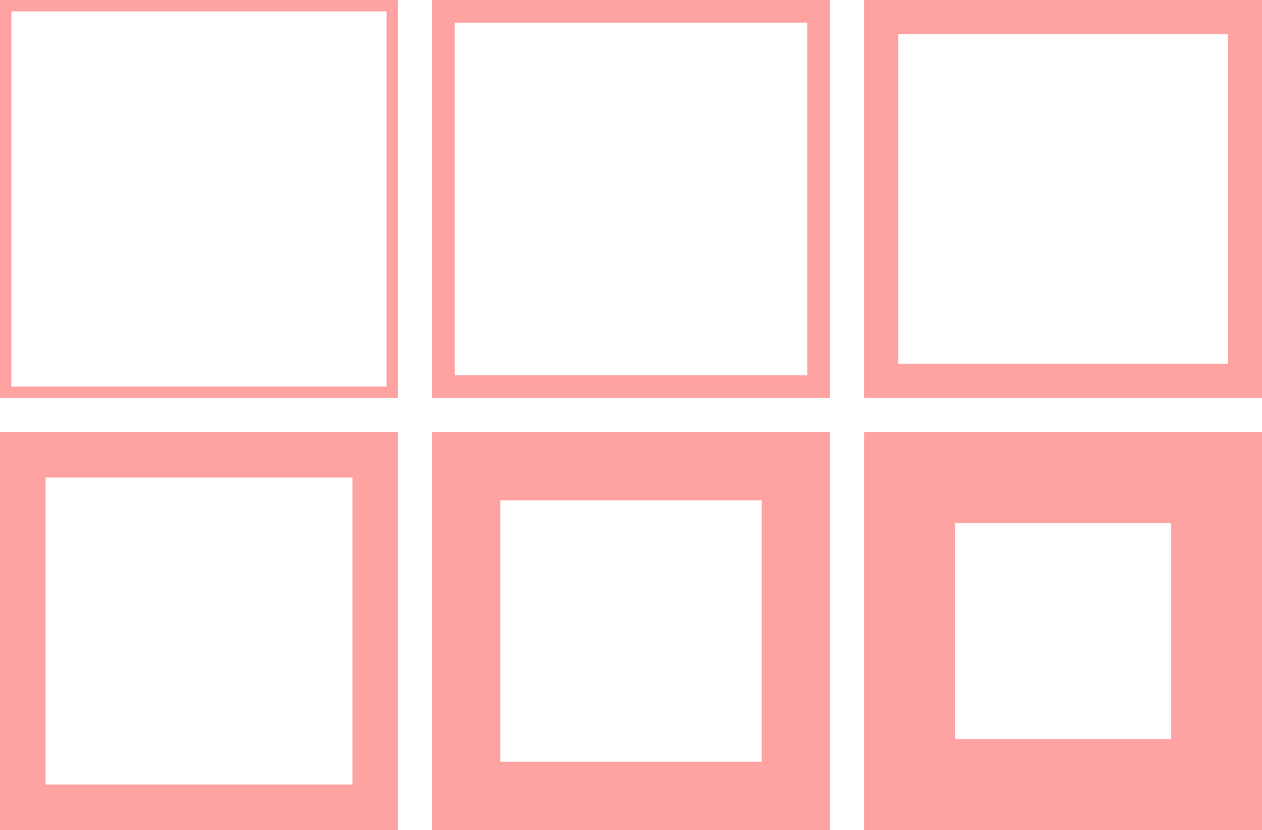
Distances
One of the main problems with the previous design was the lack of padding and spacing between elements (or spacing that was too small). Now the layout has more breathing room and is much more readable. All spacing values were also based on a 4-point grid.
Icons
The previous icon set was confusing. Some icons were blue, others were white, and different styles were mixed together – filled and outlined icons appeared in the same row. This created visual chaos in the UI. Now, all icons come from a single free set – Phosphor Icons. They follow one consistent style. I chose bold, rounded, outlined variants to match the rest of the design.


Final result
Now the entire UI is more readable and consistent. Every element has more breathing room, which makes the whole project more aesthetic and visually pleasing. Color is used only when necessary. Rounded corners make the interface feel smoother, and proper spacing clearly separates content from other elements.


Design tokens overhaul
My task as a designer was to create new design tokens that are more accessible, consistent and aesthetic both in light and dark modes. I was asked to do this without making any major layout changes. The old design was not accessible – everything was too small and had low contrast.
Colors
The previous design had many problems with color usage. It was inconsistent and chaotic. I decided to use a monochromatic color scheme to make the whole project more consistent. Instead of pure black and white, I used shades of gray, which made the color palette smoother. I also reduced the number of colors in the project. Now, color is used only for important elements that need to be eye-catching.
Roundings
Every element in the former design had sharp corners, which gave it an outdated look. User testing showed that rounded elements feel softer and more inviting, making users more comfortable while using the app. All corner radius values were based on a 4-point grid, ensuring that every element fits consistently with the others.
Distances
One of the main problems with the previous design was the lack of padding and spacing between elements (or spacing that was too small). Now the layout has more breathing room and is much more readable. All spacing values were also based on a 4-point grid.
Icons
The previous icon set was confusing. Some icons were blue, others were white, and different styles were mixed together – filled and outlined icons appeared in the same row. This created visual chaos in the UI. Now, all icons come from a single free set – Phosphor Icons. They follow one consistent style. I chose bold, rounded, outlined variants to match the rest of the design.
Final result
Now the entire UI is more readable and consistent. Every element has more breathing room, which makes the whole project more aesthetic and visually pleasing. Color is used only when necessary. Rounded corners make the interface feel smoother, and proper spacing clearly separates content from other elements.
2026 © Designed and developed by Filip Grzesik